Collage
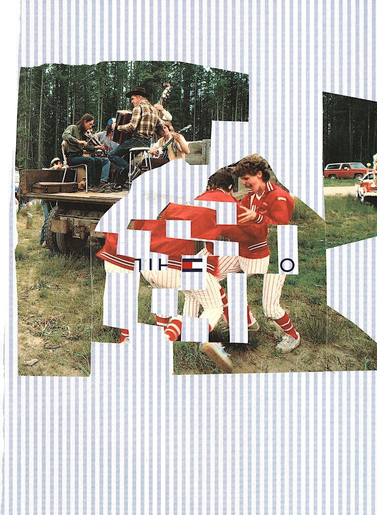
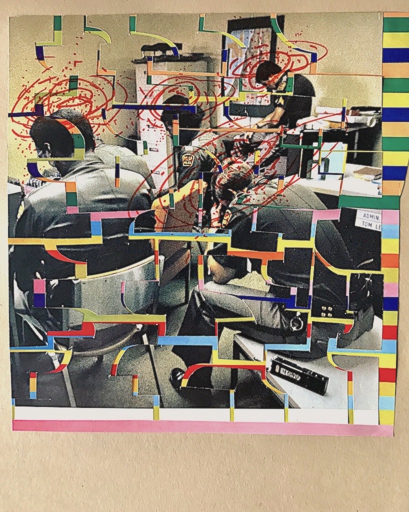
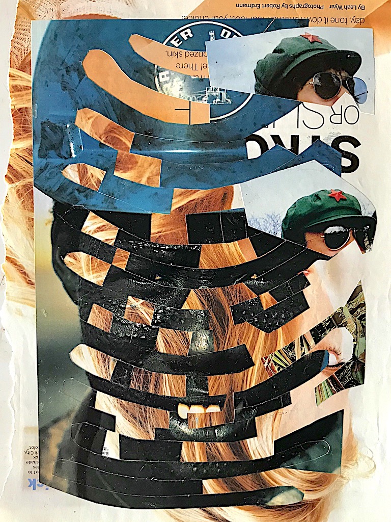
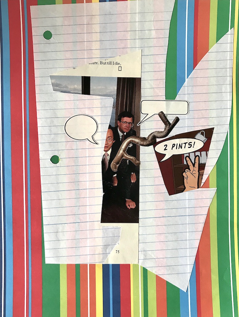
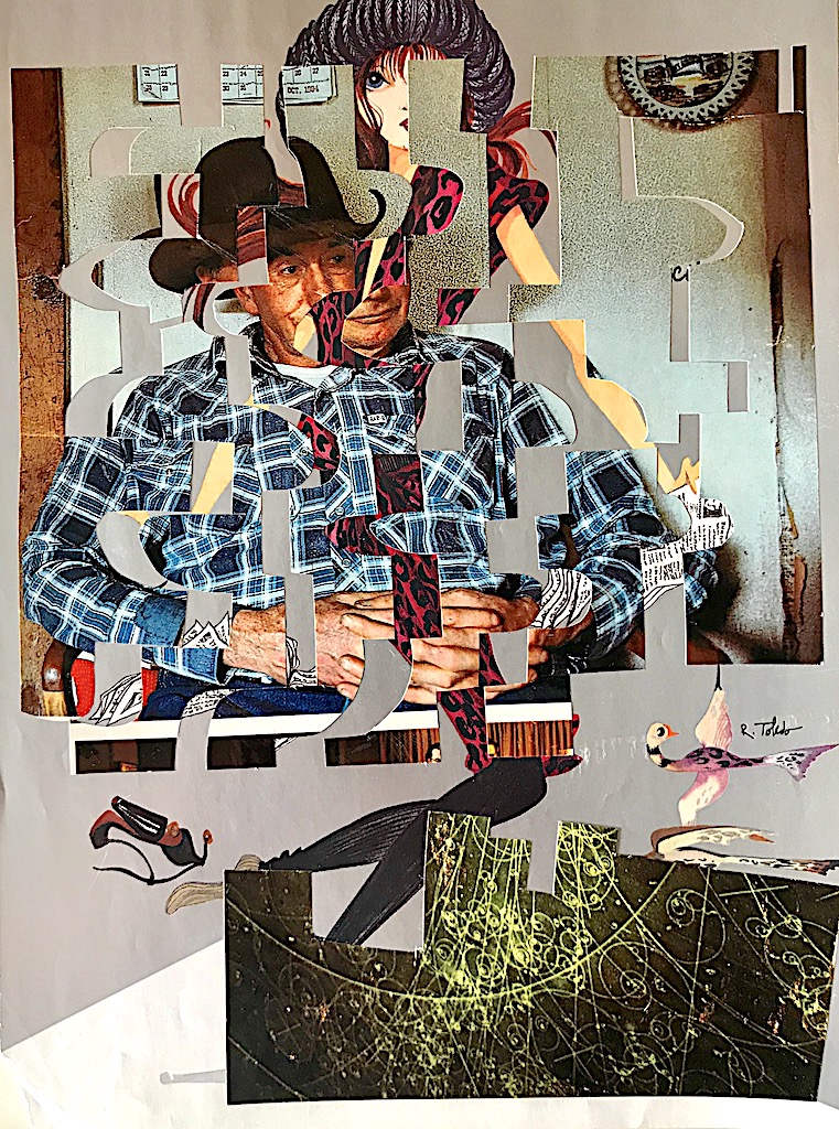
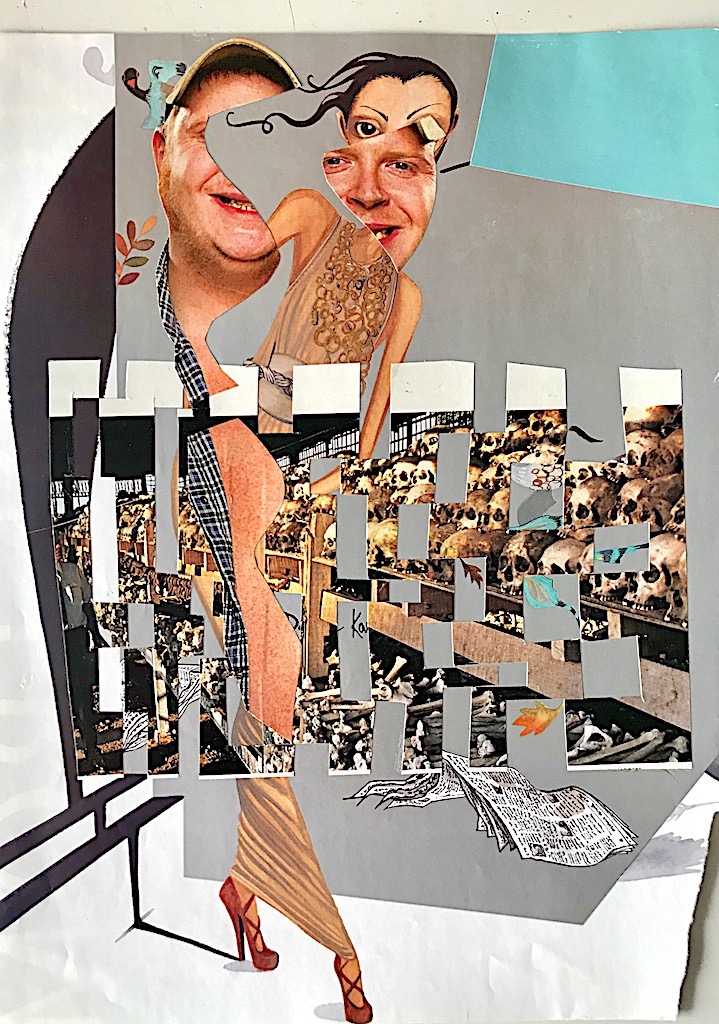
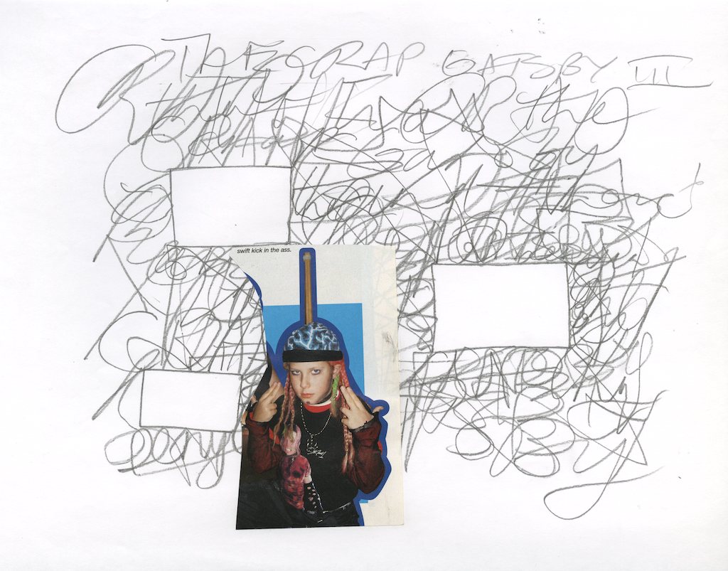
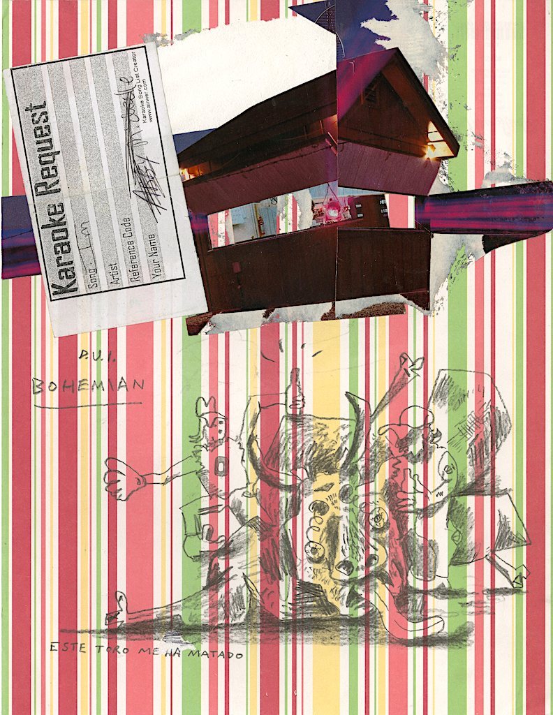
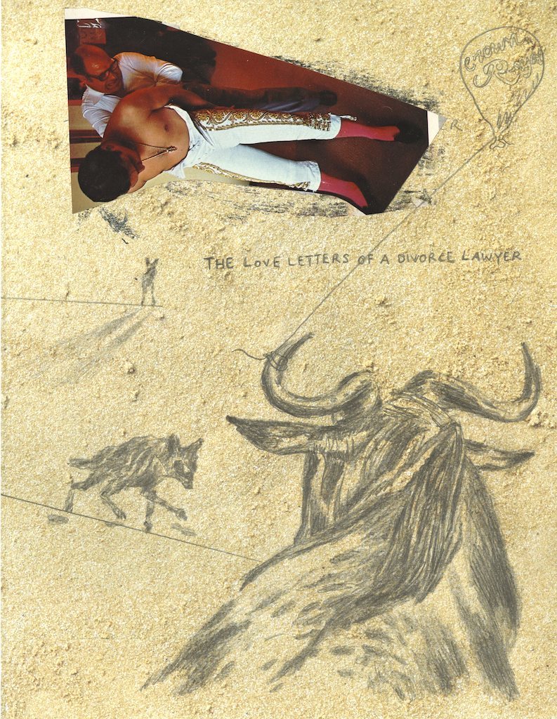
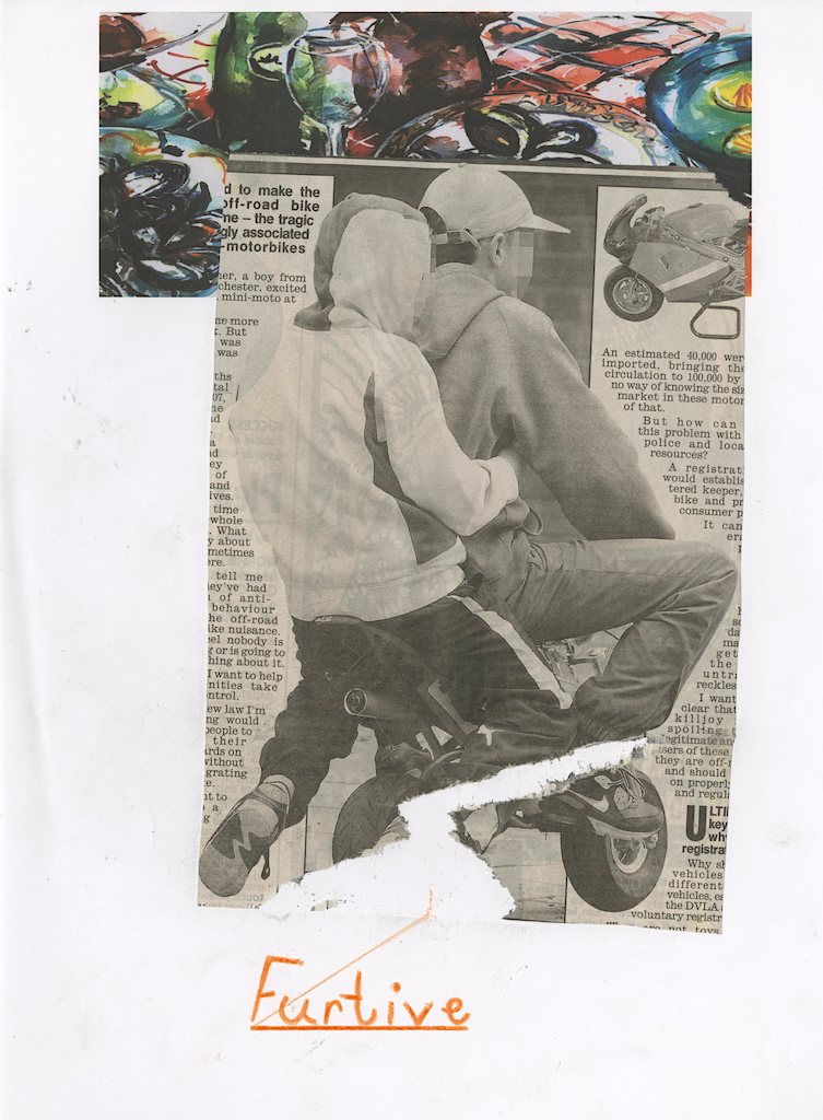
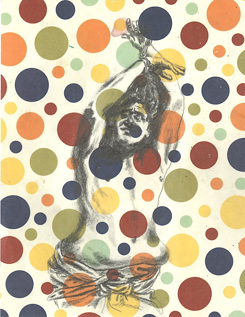
As a consequence of print recycling at a public library, I was able to acquire hundreds of magazines, giving me a vast image resource. Titles included National Geographic, Vogue, Field And Stream, World Wrestling Entertainment and Scientific American. My starting point was simply to orchestrate contrasting photographic styles into single works. I spliced and wove images into each other and attempted a form of paving via under and overlay. Stickers were incorporated, and loaded text fragments left to hang in the sword of Damocles manner.
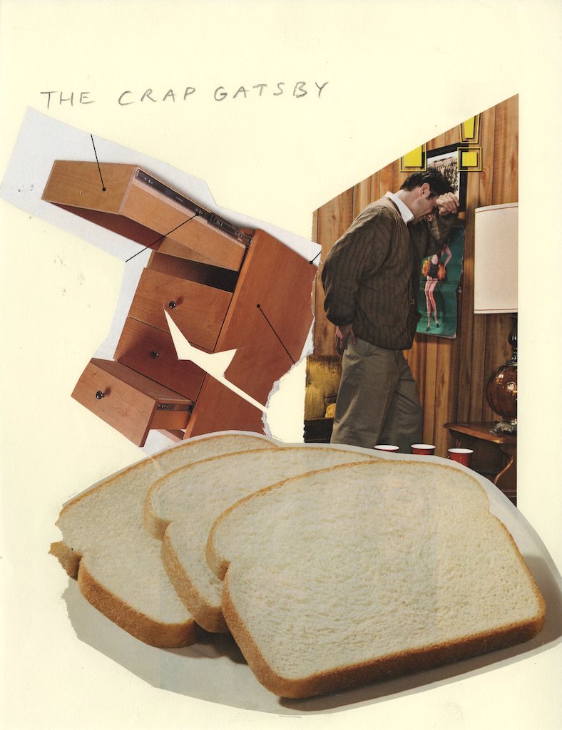
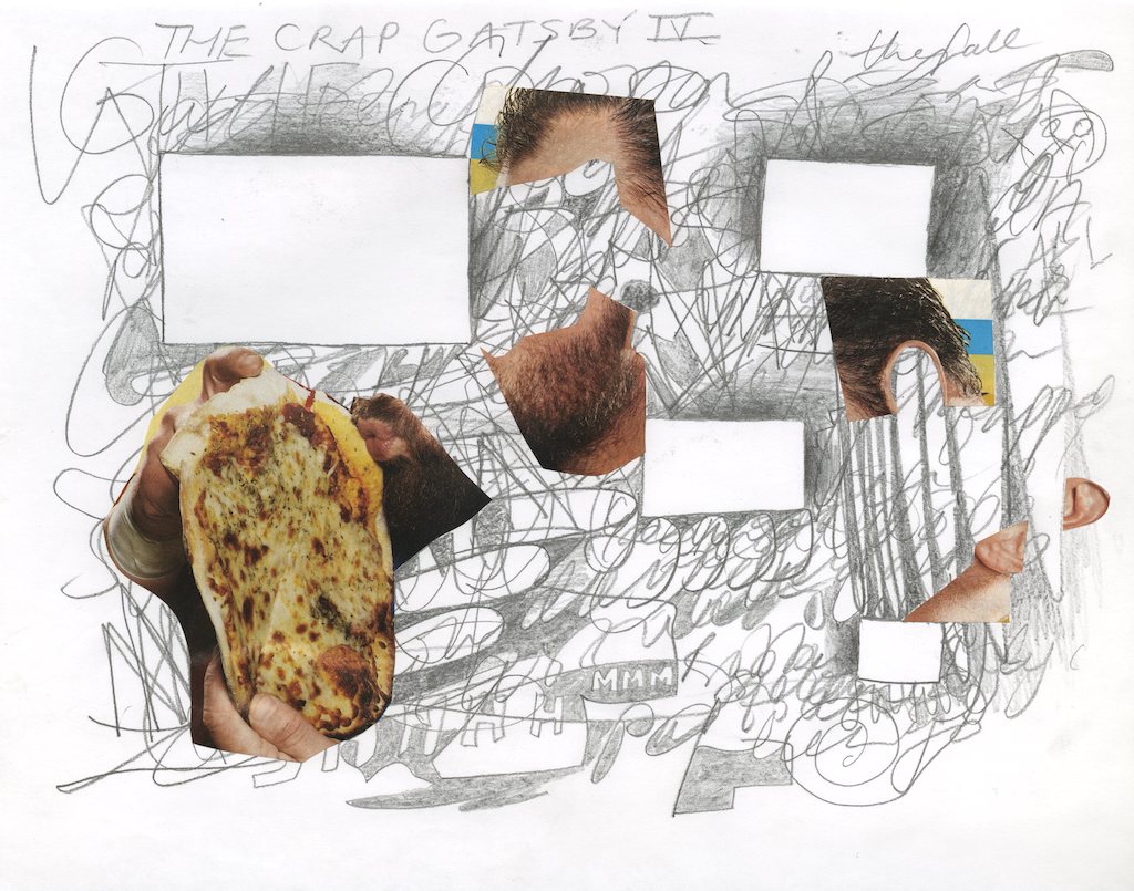
I began by looking through the magazines and selecting images that I responded to as having conceptual and aesthetic value. For example, elements in the two Images below, part of The Crap Gatsby series, appealed to me as firstly, the figure in brown clutches his buttock and seems to hang his head in despair, like a dork in defeat, so the notion struck me that this could be a snapshot of the imperturbable Jay Gatsby with his guard down, whining in anguish, alone. The white bread is a signifier of the bland, and of course the street epithet to describe the prosaic caucasian. And you are treated to Gatsby’s (animated) underwear drawer, upside down, open and empty. The spacial configurations, color palette and character of image set them on a new narrative path of emergent meaning, free from their original contexts.
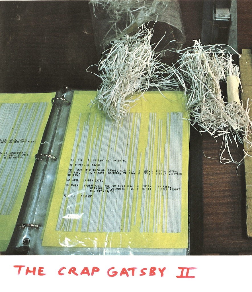
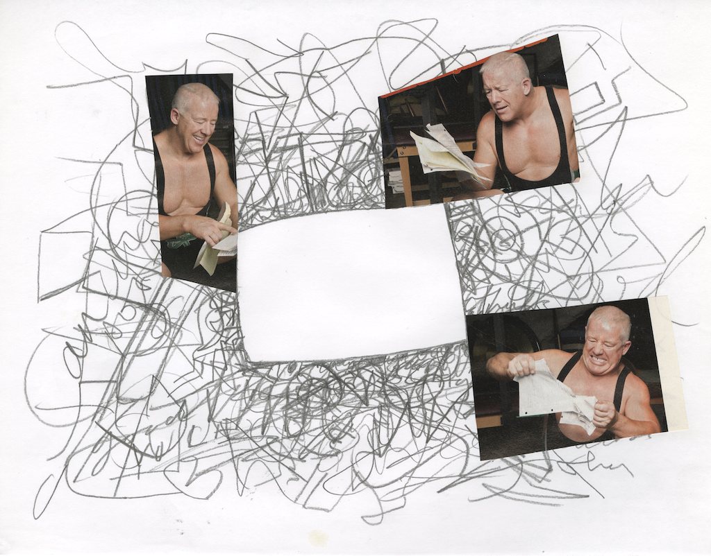
The work below right features a photograph from a Nat Geo article addressing counter espionage, shredded C.I.A. documents are recovered by the U.S. at a stage of reassembly, courtesy of the Iranian secret service. By removing the image from the magazine and pasting it to paper and adding the title in red, not only has complimentary color been introduced, meaning is diverted and the collage takes on literary significance. Is this a lost section of Fitzgerald’s novel, or it’s sequel, The Crap Gatsby… deemed terrible and destroyed by the author…mind the gap Crapsby!
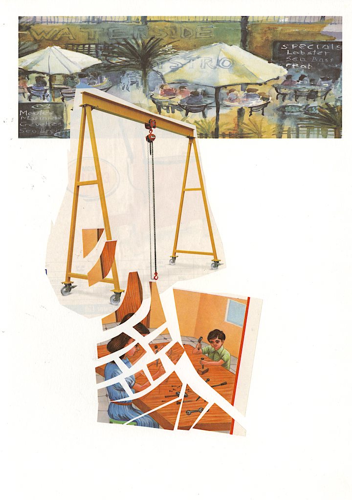
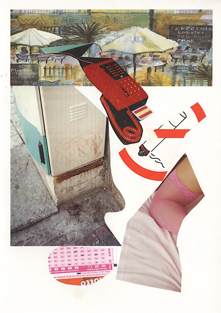
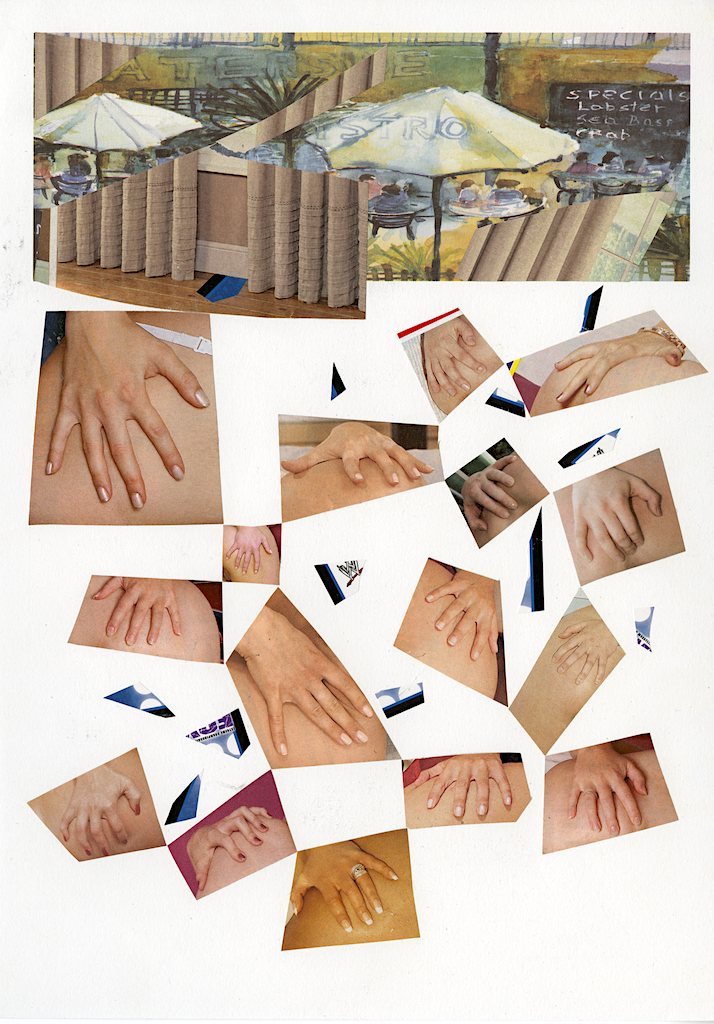
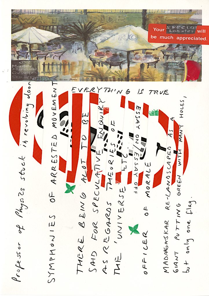
During this artist’s meteoric rise to the position of elite dish washer at a non-Michelin star bistro in the Southwest of England, collages were made using headed card stock intended for use as menus. The proprietor’s Mother, an adequate watercolorist, painted images of al fresco dining idyls which featured on each bill of fare.
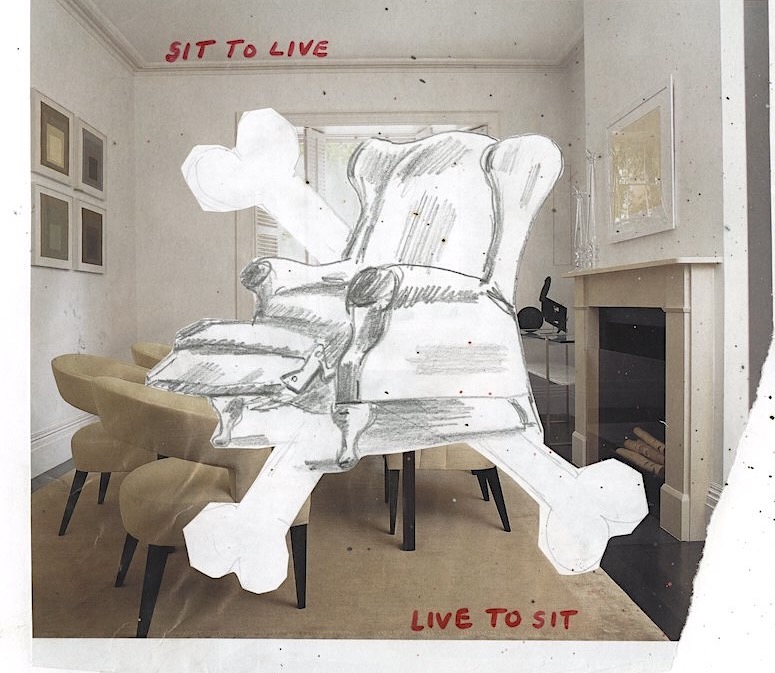
Kitchen and front of house are two different worlds, and this is also true regarding design aesthetics. The kitchen is by degrees metal, plastic and grease. Front of house, a space of wood, glass and fabric. Kitchen specializes in vulgarity, shouting, heat and speed. Front of house nurtures an impression of politeness, relaxed courtesy and comfort. The service hatch is the border checkpoint and only the food is allowed free passage, the images below are configured to reflect this.
